CI SELECT
Designing A brand to match a legacy
To mark 40 years in business, CI Select set out to strategically evolve its brand to enhance the market equity and deep relationships it had built over decades. As the leading office furniture dealer in the St. Louis market, CI Select has furnished a diverse portfolio of premier clients, including Washington University in St. Louis, the Delmar DivINe, Northwestern Mutual, Capes Sokol, and Thompson Street Capital Partners, among others.
In an industry crowded with competitors opting for full renames and reinventions, the challenge was to retain a recognizable identity while making a bold, modern statement. The existing brand lacked a clear connection to CI Select’s legacy of exceptional service and sophistication. Arcturis was challenged to reimagine the dealer’s brand in a way that honored continuity, visionary leadership, and continued excellence.
The design team started by conducting a SWOT analysis of the competitive landscape to inform the brand strategy. With many of CI Select’s competitors having recently rebranded, it was critical for this premier brand to differentiate itself and reflect the same leadership and distinction it holds in the marketplace.
“Arcturis was an outstanding partner in our rebranding journey. Their team led us through thoughtful, engaging exercises that helped us clearly define our brand direction and arrive at a logo that truly represents us. They were professional, focused, fun, and a pleasure to work with throughout the entire process.”
-Claire Erker, CEO
As part of the predesign discovery process, the design team also developed user personas to ground the rebrand in the needs and perceptions of its audience. These personas served as a continual reminder that a successful rebrand must be seen, understood, and experienced by the end user--not solely shaped by internal stakeholder preferences to ensure the final outcome resonated authentically in the marketplace.
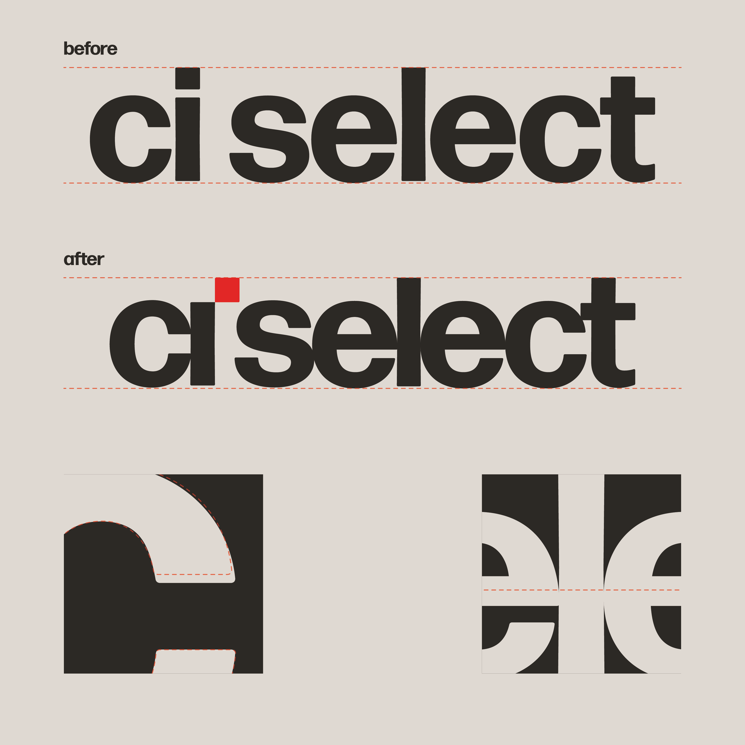
After a discovery session with CI Select’s leadership, it became clear that what began as a brand refresh needed to evolve into something bigger, bolder, and worthy of celebrating 40 years in business. The existing brand was too limited. Its color palette lacked vibrancy, the typography felt too thin, and the vertically oriented icon constrained flexibility. In response, clarity, longevity, confidence, and strong typography emerged as defining principles for the new brand.
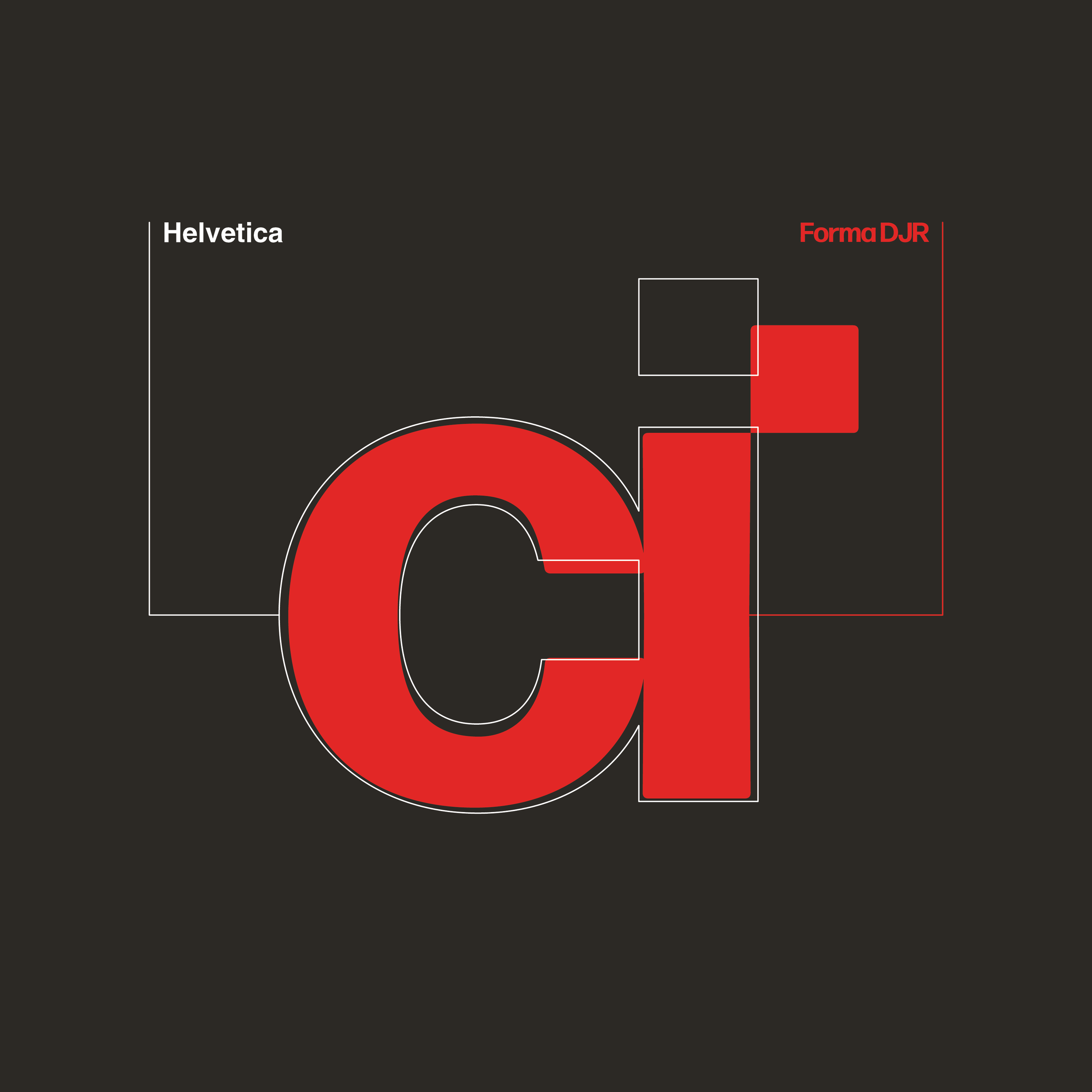
Many of the furniture brands CI Select represents are rooted in midcentury design principles: prioritizing functional, uncluttered spaces defined by organic and geometric forms, clean lines, and minimal ornamentation. To align with this ethos, the brand identity was designed to reflect these same values, including the use of Helvetica, a classic midcentury typeface that reinforces clarity, simplicity, and timelessness.
This led the design team to do a deep investigation into the history, usability, and enduring relevance of Helvetica. We examined why it appears in so many iconic brand marks, from its adoption in the New York City subway system for unmatched legibility and accessibility to Apple’s use of Helvetica Neue in iOS 7 to create a clean, highly readable digital experience. While this reasoning aligned with CI Select’s values, we agreed together that an extra step should be taken to differentiate the brand.
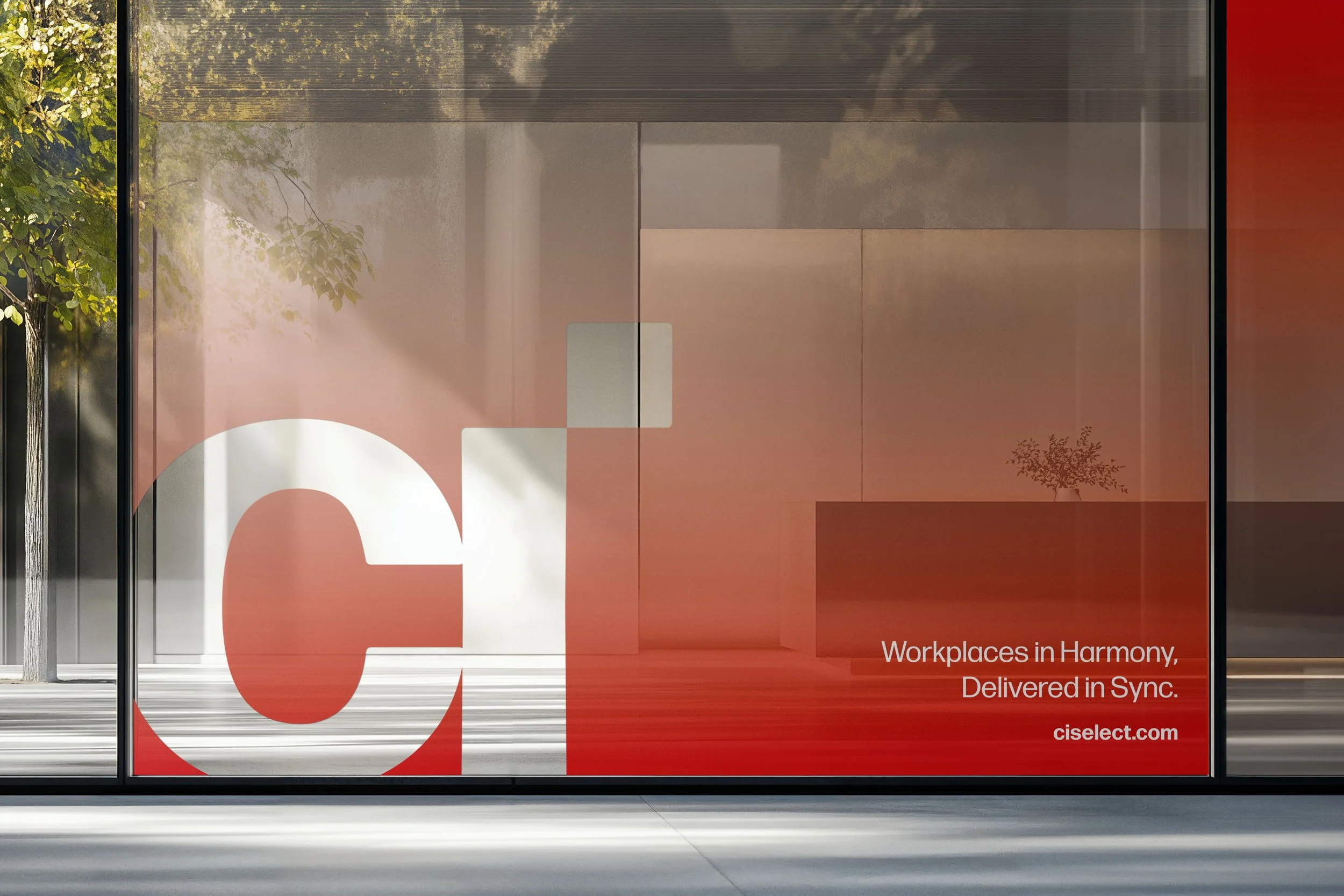
Further discovery explored a color strategy informed by midcentury modern (MCM) design principles, reflecting the heritage of many brands in their portfolio. Through targeted color studies, the palette was developed to balance warmth and restraint--drawing on classic MCM tones that feel timeless, functional, and approachable. This approach reinforces CI Select’s alignment with midcentury modern values while supporting a cohesive, contemporary brand expression.
Forma DJR emerged as the ideal solution, highly legible, classic, and equally modern. Distinct from the more neutral Helvetica, its subtly rounded corners and gentle calligraphic forms introduce a humanist quality that resonated strongly with the CI Select team. In guiding the client beyond the original request for a simple refresh, our team intentionally pushed the brand outside its comfort zone, designing a solution that better supports long-term success and celebrates the company’s evolution.
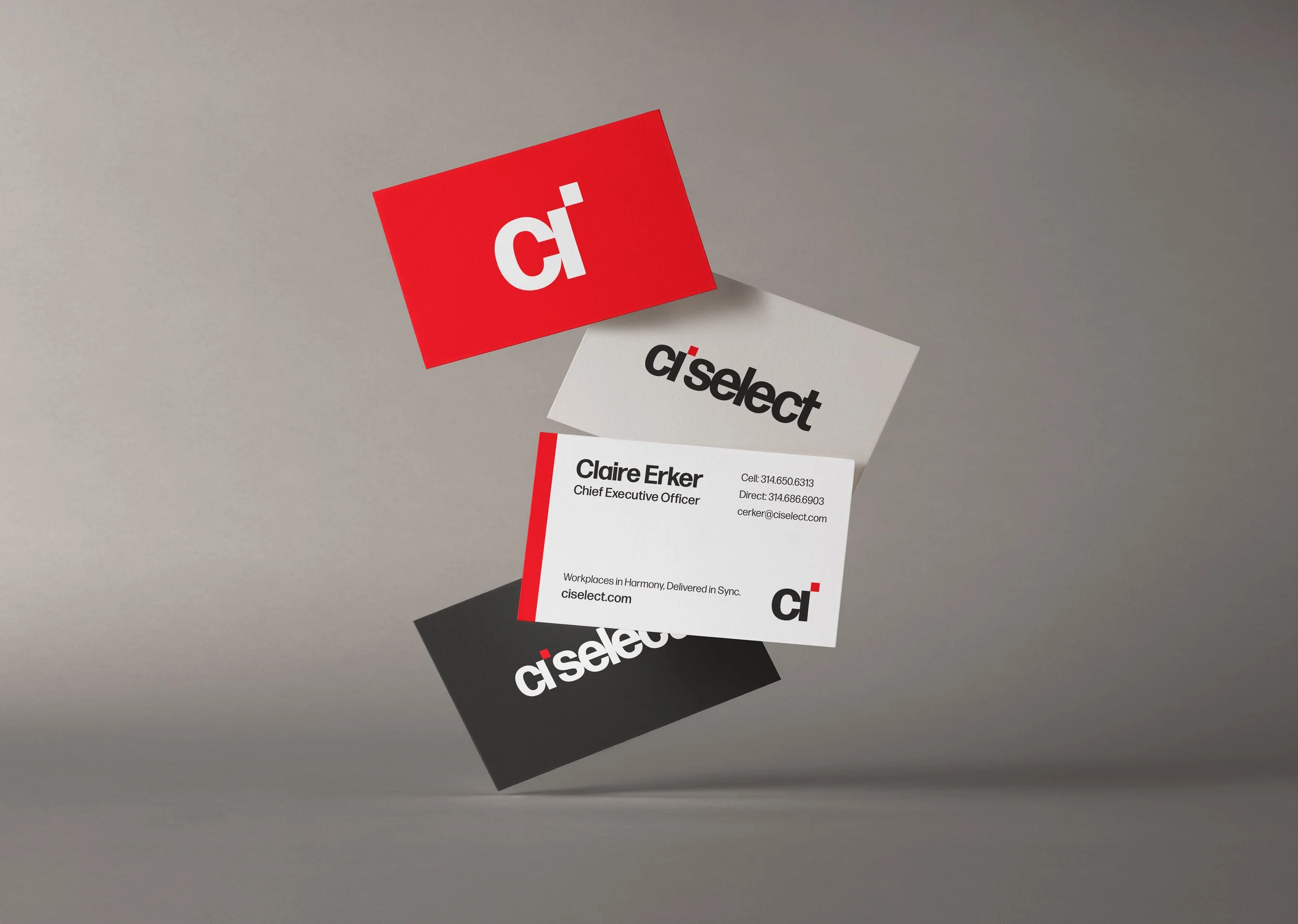
Grounded in principles of design excellence, the typeface supports functionality and well-being through enhanced legibility. Its roots in midcentury modern design ensure durability and resilience by avoiding short-lived trends. Innovation was embedded throughout the process as we educated and partnered with CI Select to expand their vision and establish a brand built for the future. To make the system distinctly ownable, we customized Forma DJR by refining spacing, hand-kerning key elements, and designing a bespoke letter “i,” transforming a timeless typeface into a unique and recognizable brand signature.
“Working with the Arcturis team was exciting and fun. The process they took us through led us in a direction that was so unexpected. They really spent time getting us to evaluate our likes/dislikes and preconceived ideas of what our new logo should be in a way that was creative and interactive. The end result was perfect and appeased all decision makers, but it was the process that I really enjoyed the most!”
Jenna Knatt, Director of Business Development
